

A website with two jobs: fill the app, and fund it
sozoradio.org has to convince a stranger to download a worship app, and convince a listener to start giving. We designed and built it around those two paths, and wrote the content that carries them.
- Role
- Web design, build, content strategy
- Type
- Nonprofit marketing site
- Built on
- Wix, so the team can edit it
- Status
- Live at sozoradio.org
- Conversion paths
- 2
- Pages, no more
- 6
- Entry point for giving
- $10
- Free trial on sign-up
- 7 days
A nonprofit site usually tries to do eight things at once.
SOZO RADIO came to us with the familiar version of this problem. There was a story to tell about the ministry, an app to promote, a podcast, a newsletter, a donor programme, and a mailing list, all with equal billing and none of them winning.
We cut it back to two outcomes that actually pay for the organisation: get the app downloaded, and turn a listener into a monthly giver. Everything else on the site now exists to serve one of those, or it earns its place by supporting both.
- Six pages total, each with a single job
- Every page ends in either a download or a gift
- Built on Wix so the team edits copy without us
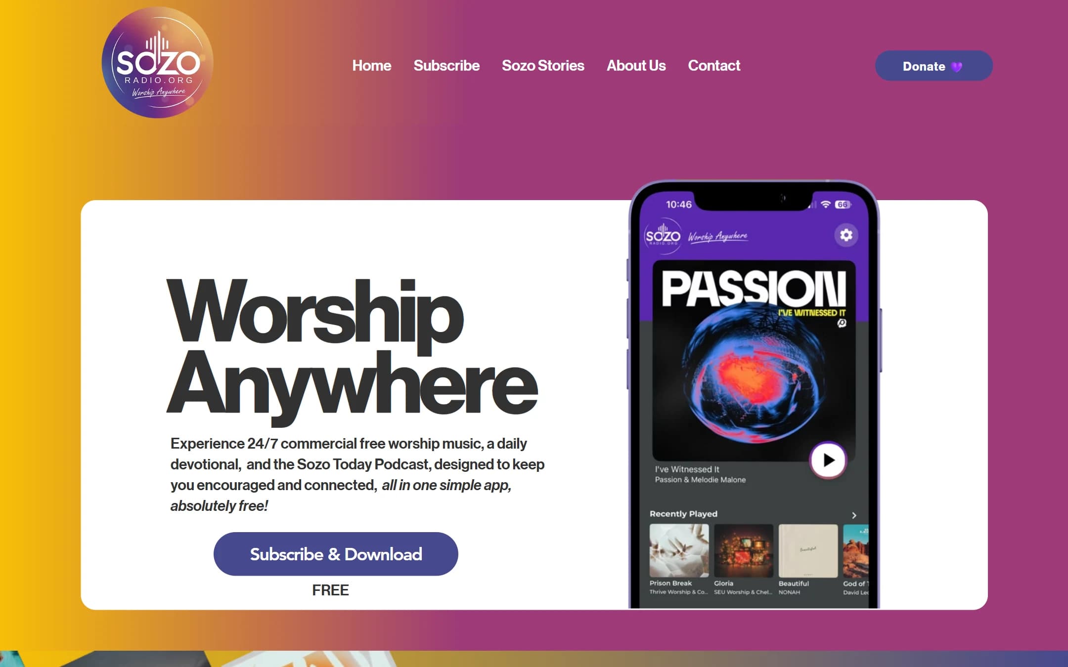
Two words, one button, and the app in your hand.
Worship Anywhere is the whole proposition, so it is the whole hero. Next to it sits a phone showing the real player screen with real album art, because a screenshot of the product outperforms any illustration of it.
The word underneath the button is FREE, in capitals, on its own line. That single word answers the question every visitor is silently asking, and it removes the hesitation that a Subscribe label creates on its own.
Below the fold the page argues its case in the order people actually ask: which artists, what the devotionals look like, what the podcast is, and then what other listeners say about it. Laura, Trisha, Scott and the rest are named because a first name and a real sentence beat a five star graphic.
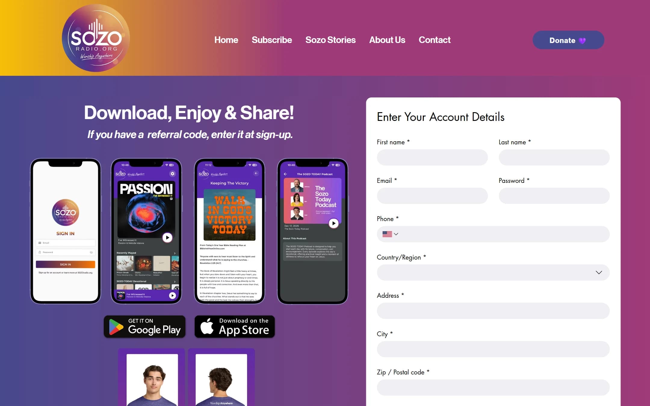
The Subscribe page picks up the same argument and closes it. Same promise, same button, plus the seven day trial, so a visitor who arrives there from an app store listing or a QR code is not starting the pitch over.
Nobody wants to be a donor. They want to be part of it.
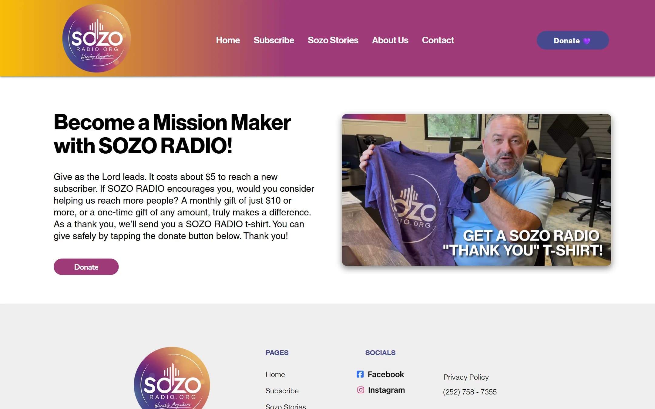
The giving page is built around a name rather than an amount. Becoming a Mission Maker starts at $10 a month, or $100 once, and it comes with a SOZO RADIO shirt. The shirt is not the incentive so much as the proof that a real person on the other end noticed.
We deliberately kept the ask low and specific. A $10 entry point converts a listener who has never given to anything online, and the monthly framing gives the ministry the predictable income that a scattering of one-off gifts never does.
- Named programme, not a generic donate button
- A $10 monthly entry point aimed at first-time givers
- A physical thank-you that makes the gift feel received
The newsletter is printed. The website is where it lands.
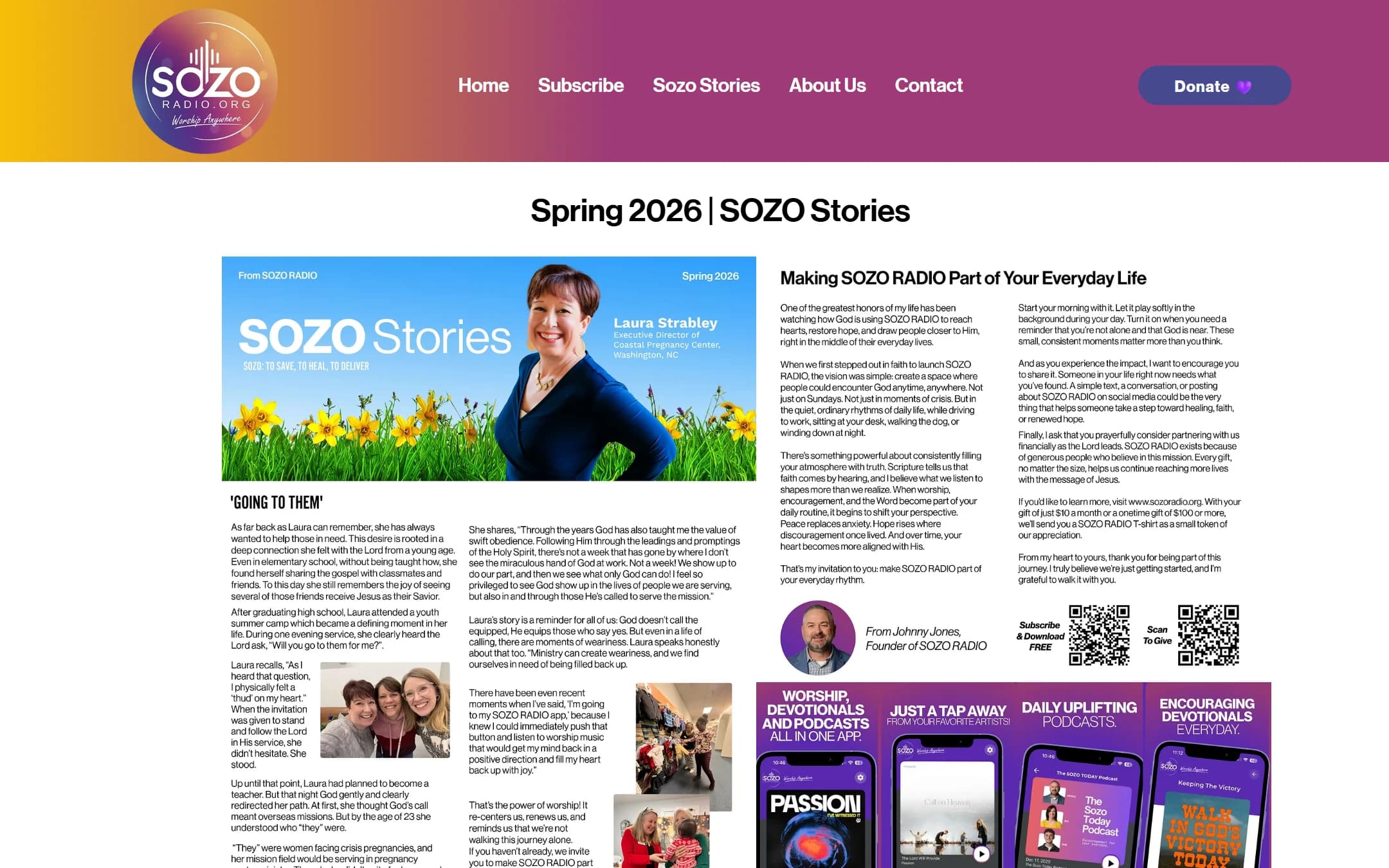
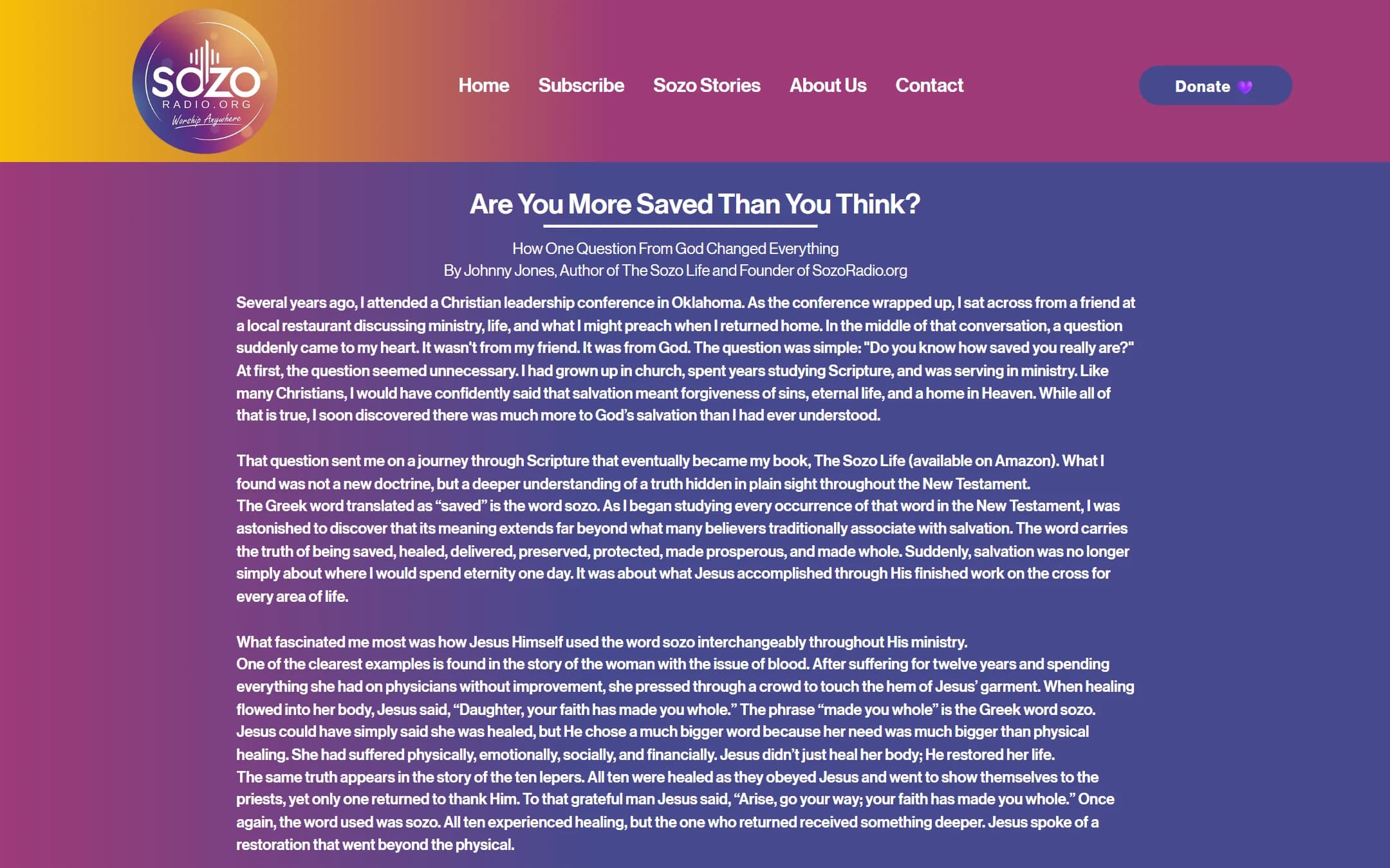
SOZO Stories goes out as a physical newsletter, which for this audience still works better than an email campaign. The Spring 2026 issue leads with Laura Strabley, who runs a pregnancy centre in Washington, North Carolina, and it reads like something a person wrote.
Our job was to make print and web pull in the same direction. The printed issue carries two QR codes, one to download the app and one to give. The web version hosts the same story so it can be shared in a text message. A reader who puts the paper down can pick the story back up on their phone without hunting for it.
Say who you are before you ask for anything.
The About page does the work that makes the giving page possible. It names SOZO Communications, Inc. as a registered 501(c)(3), explains where the name comes from, and puts Johnny Jones on the page as a person rather than a title.
It also runs the 30-Day SOZO Challenge, which is the softest commitment on the site. Try it for a month. No card, no pitch. It gives a hesitant visitor something to say yes to that is not a download and not a donation, and it gives the ministry a month of daily contact to make its own case.
A site the ministry runs without calling us.
sozoradio.org now sends visitors to the App Store and Google Play, signs them up for a seven day trial, and asks for a monthly gift, on six pages that a four-person team keeps current themselves.
Choosing Wix was a budget decision and we would make it again. The money went into the parts that change the outcome, which are the argument, the ordering, and the words, rather than into infrastructure a ministry this size would have to pay someone to maintain.
What we built it with
Chosen so a four-person ministry can keep the site current on its own. The budget went into the argument and the words rather than into a stack somebody would have to maintain.
Wix
Figma
App Store
Google Play
What shipped
- Six pages, each pointed at a download or a gift
- Homepage built around the product screen and the word FREE
- Mission Maker giving programme with a $10 monthly entry point
- Printed SOZO Stories and the web edition sharing QR codes
- 30-Day Challenge as a low-commitment first yes
- Handed over on Wix, edited by the client since launch
Want results like these?
Book a free 30-minute call. We'll scope your project, recommend the right approach, and tell you honestly if we're the right fit.