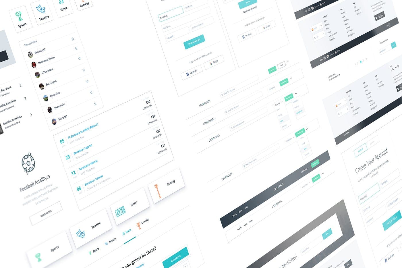


Design System Development
Consistency at scale, maintained automatically - reusable components and tokens that keep every product surface aligned.
Trusted by companies that ship production software on deadline







Everything you need, nothing you don't
We scope each engagement precisely so you get senior-level work on the capabilities that matter.
Component libraries
Reusable UI components - buttons, inputs, modals - documented and coded so teams ship faster with fewer one-offs.
Design tokens
Single source of truth for color, spacing, typography, and radius - synced between Figma and code automatically.
Documentation
Usage guidelines, do's and don'ts, and live examples - so designers and engineers know exactly how to use each component.
Versioning
Semantic releases with changelogs and migration guides - so updates roll out without breaking existing screens.
Accessibility baked in
WCAG-compliant components with keyboard support, focus states, and ARIA patterns built into every primitive.
Developer handoff specs
Props tables, code snippets, and Storybook stories - so engineers implement components correctly the first time.
From scattered UI to a single source of truth
We audit your existing product, extract patterns, and build a system that scales with your team - not against it.
- Learn more
Week 1: Audit & token foundation
We inventory existing UI patterns, define design tokens, and prioritize components by usage frequency and impact.
- Learn more
Weeks 2-8: Build & document
Core components ship in Figma and Storybook incrementally - with accessibility checks and visual regression tests.
- Learn more
Rollout: Adoption & governance
We train your team, establish contribution workflows, and set up versioning so the system stays healthy long-term.

Renting is local, so search had to understand a place and a date range as one question rather than two filters. Mirimera built the marketplace and the software our suppliers run on, and because it is one system underneath, nothing has ever had to be kept in sync.
- Pablo
CEO, Big RentalsDesign system stack
Tools that connect design and code - keeping tokens, components, and documentation in sync as your product evolves.
Figma
Component libraries and variables as the design-side source of truth for your system.
Storybook
Interactive component workshop for building, documenting, and testing UI in isolation.
Chromatic
Visual regression testing that catches unintended UI changes before they reach production.
- a
Style Dictionary
Transforms design tokens into platform-specific formats - CSS, iOS, Android - from one JSON source.
Tokens Studio
Figma plugin for managing and syncing design tokens between design files and code repositories.
- 0h
Zeroheight
Living documentation that connects Figma components to Storybook stories and usage guidelines.


Ready to build a design system that scales?
Book a free 30-minute call. We'll audit your current UI, estimate scope, and outline a rollout plan for your team.